See Thru Technologies
See Thru is a tech startup in the process of creating a widget to help beauty brands offer ingredient transparency. I am one of three designers working as a team on their product pre-launch. My role includes working on their brand identity, product design, web design, motion graphics, and UX/UI. This has given me the opportunity to directly coordinate the myriad design needs of the project holistically.
Identity
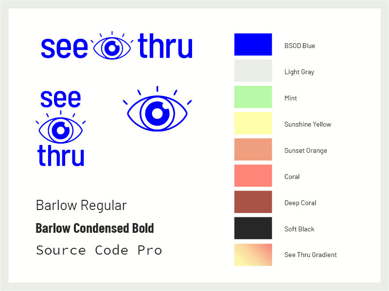
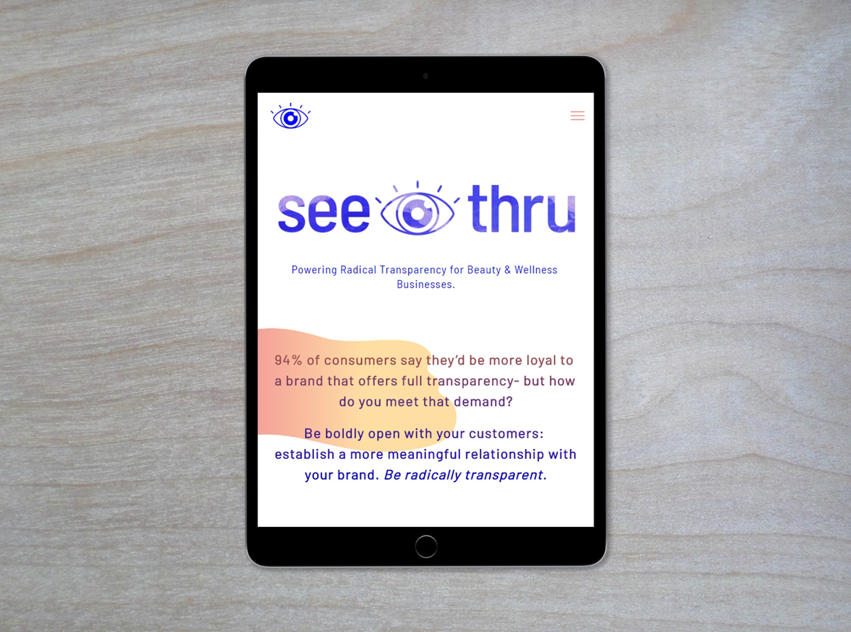
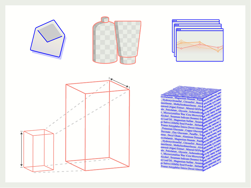
We cultivated a look that we termed "tech trash" which uses colors and type evocative of classic tech UI. To incorporate the idea of transparency into the design we utilized elements of water and transparency grids.
Motion Graphics
I created a video header and animated mini-explainer gif for the website, as well as a series of small accent animated gifs.
Iconography
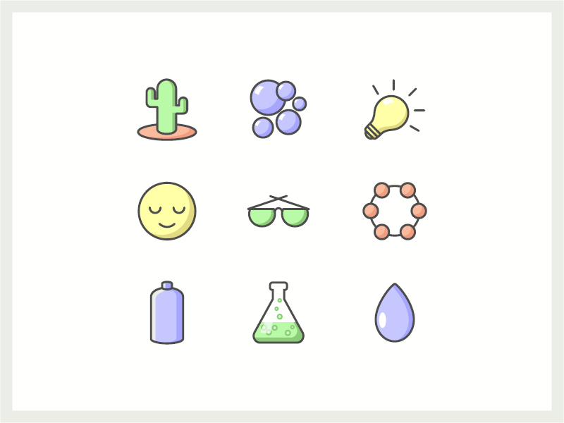
I developed a style for iconography to maintain a distinct and consistent look throughout the widget. This includes specifications for shadows, colors, and lines.
UX/UI Development
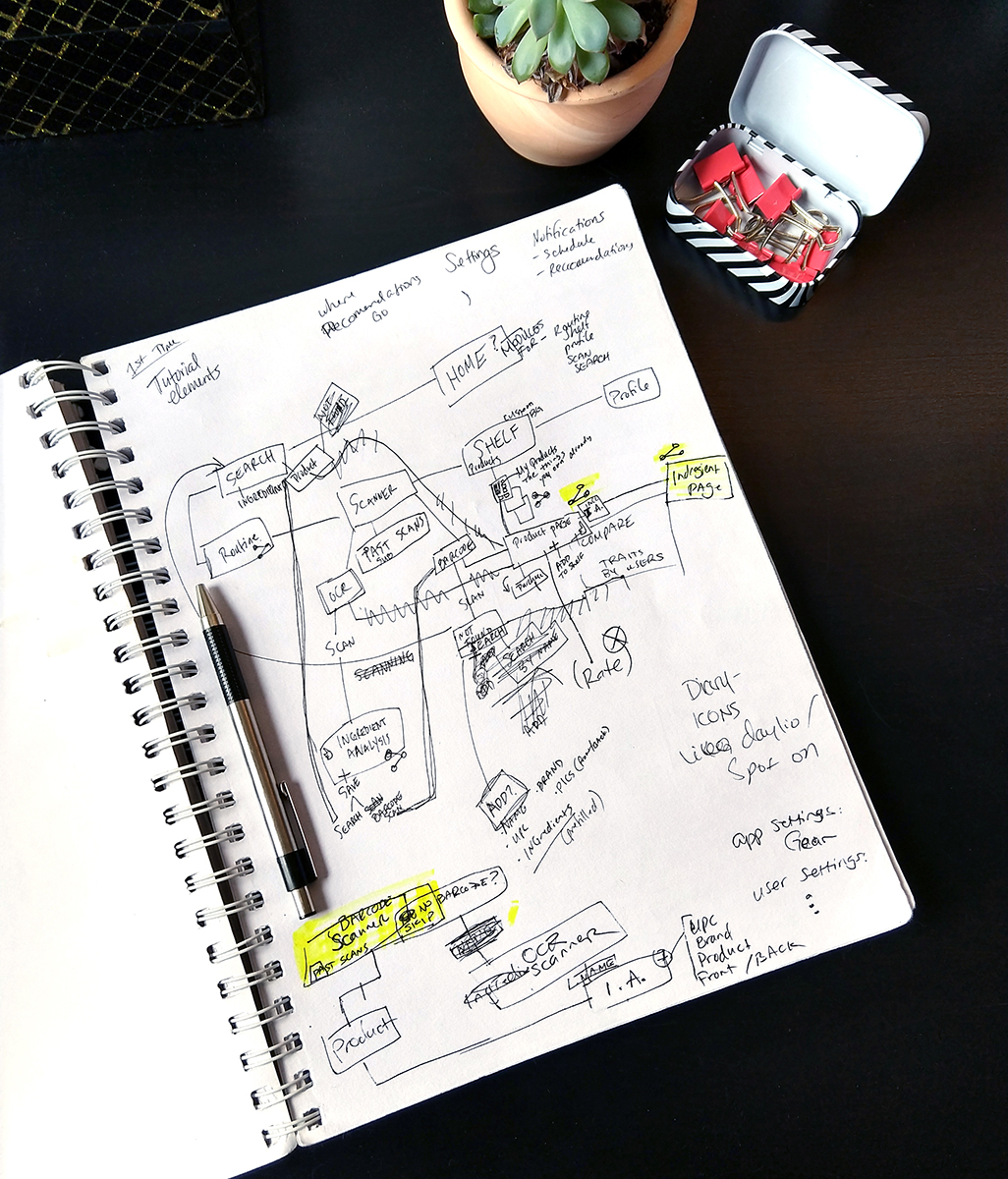
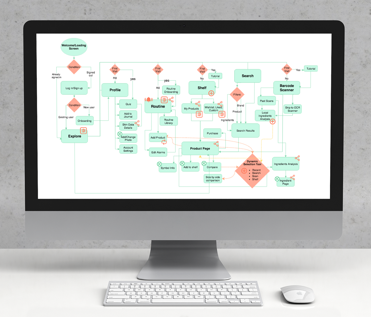
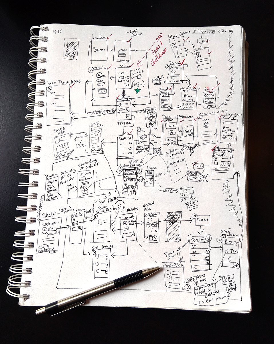
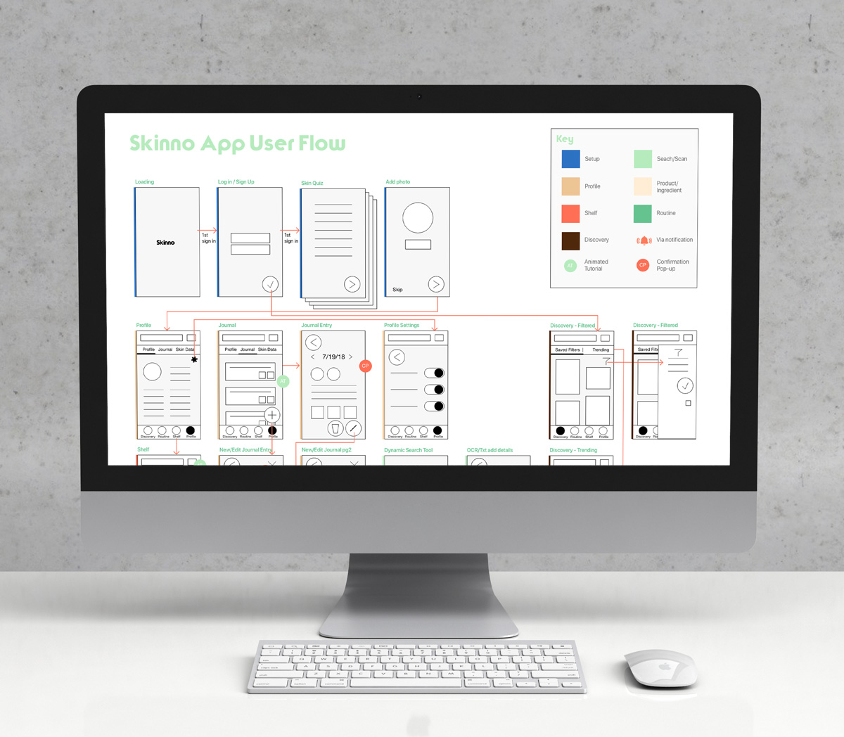
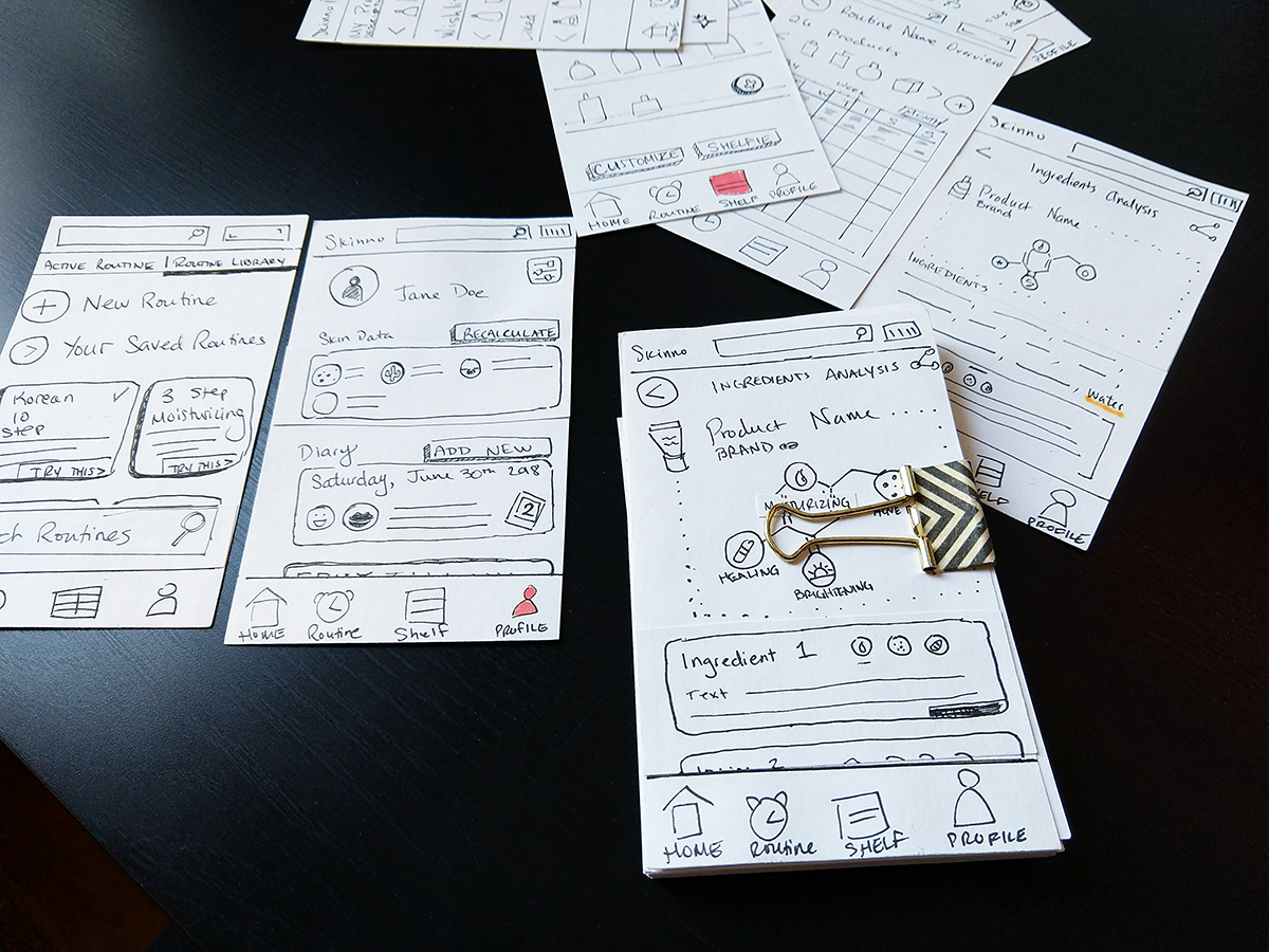
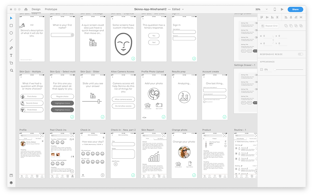
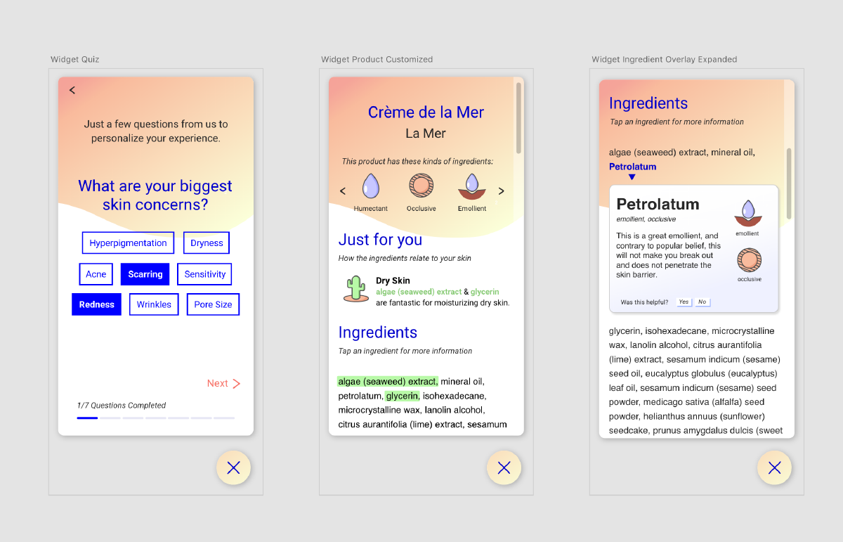
The first iteration of See Thru's product was an iOS consumer app. I developed a site map and user flow before beginning the low-fi prototype of the app on good old index cards. I took those designs to Adobe XD for wireframing. After See Thru pivoted to a B2B widget our two person UX/UI team began the process of adapting the existing wireframes to the new format inside XD. Finally we created a hi-fi prototype and handed it off to our developer.